Ranking all 30 NBA City Edition uniforms: Lakers, Celtics, Knicks among league's worst
Trolley tracks and Mile High magic are among the features highlighted in the 2023-24 NBA City Edition jerseys.
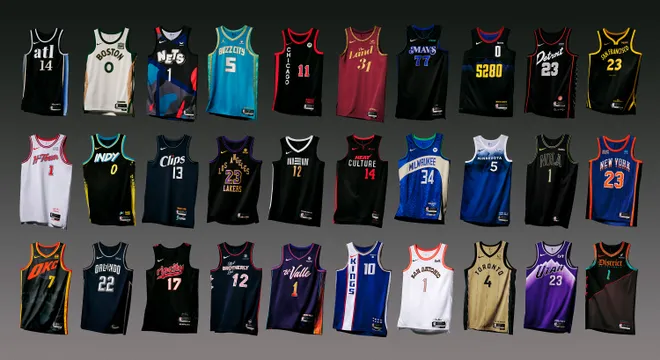
On Thursday, the league revealed City Edition uniforms for all 30 teams. This is the seventh season the NBA has partnered with Nike for the designs that represent each team's fanbase and tradition.
This season, the City Edition uniforms hold extra importance as they will be worn during the first in-season tournament, where teams will compete for the NBA Cup. The uniforms coordinate with colorful court designs that were released on Monday.
The City Edition uniforms always raise eyebrows for their eye-catching designs, or lack thereof. This year, several of the designs leaked early, garnering early reviews from fans and social media personalities.
LOOK BACK:Check out last year's NBA City Edition uniform rankings
Now that all 30 uniforms have officially been released, here are the NBA's 2023-24 Nike City Edition jerseys, ranked from best to worst:
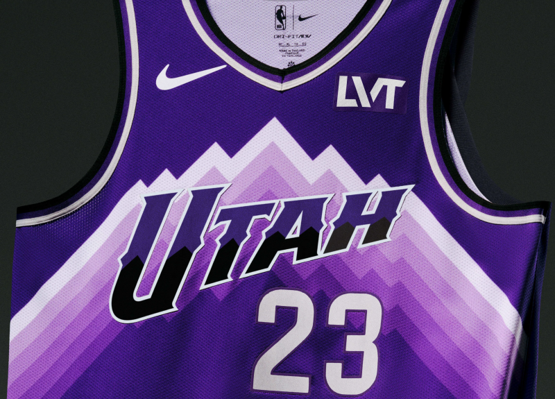
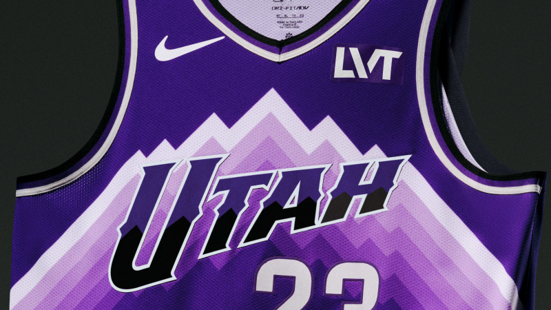
1. Utah Jazz
In a sea of lackluster designs, the Utah Jazz's City Edition uniform just feels right. The fans got an abundance of the purple that they love. There's no secondary color to distract or water it down. There's no clever wordmark replacing "Utah." It's just pure bliss.
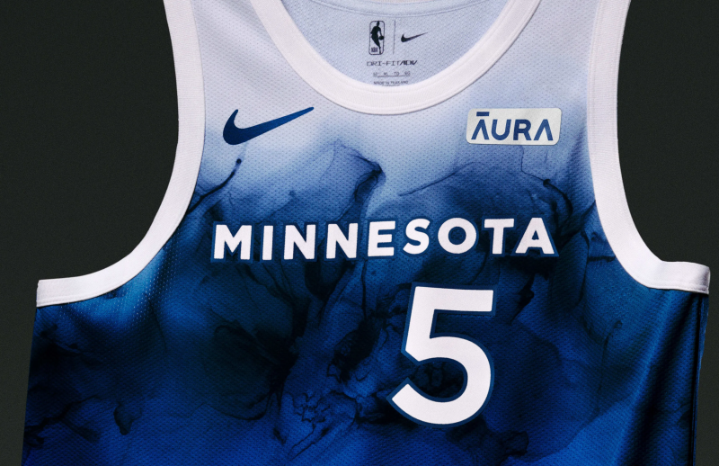
2. Minnesota Timberwolves
The Minnesota Timberwolves' City Edition jersey stands out as a unique, thoughtful design. The blue ombre is really pretty and calming. It really captures Minnesota as "The Land of 10,000 Lakes."
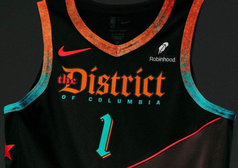
3. Washington Wizards
Kyle Kuzma apparently isn't a fan of the Washington Wizards' City Edition uniform, but we happen to disagree. This one feels like it's right out of "National Treasure," and that's a good thing. The bronze-to-patina (that teal color that metal turns when it oxidizes) is really cool and all the details flow for a good representation for the nation's capital.
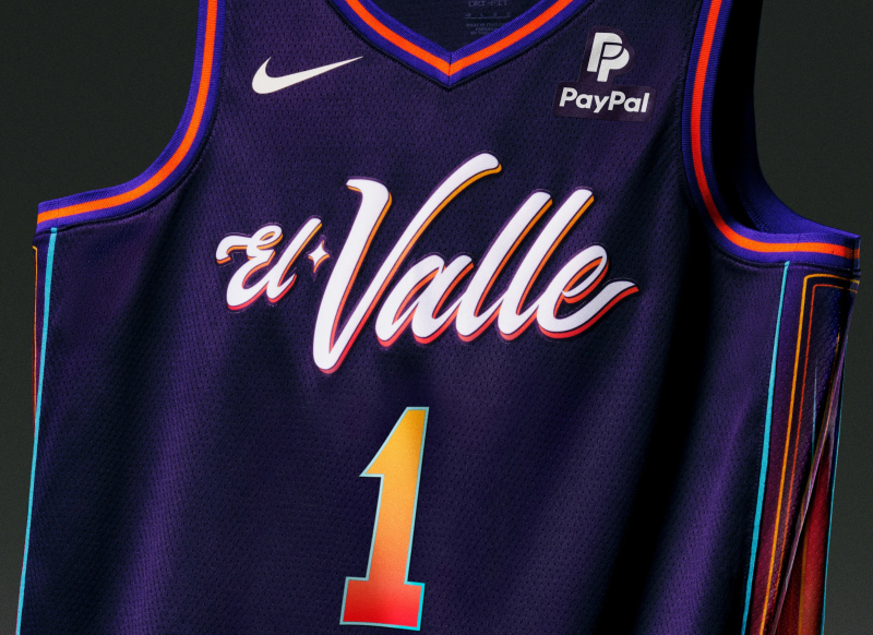
4. Phoenix Suns
The use of team colors for the Phoenix Suns' City Edition jersey is well done (the purple is nice and deep) and the line details do a good job of paying tribute to lowrider culture. Replacing "The Valley" with "El Valle" to connect with the city's Mexican community is really smart.
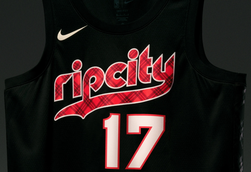
5. Portland Trail Blazers
The Portland Trail Blazers wanted to pay homage to Hall of Fame coach Dr. Jack Ramsay and his eccentric plaid outfits. Fans were complaining about the leaked images, but the design is thoughtful. The plaid also invokes punk, which is maybe not what the team was going for, but helps set it apart.
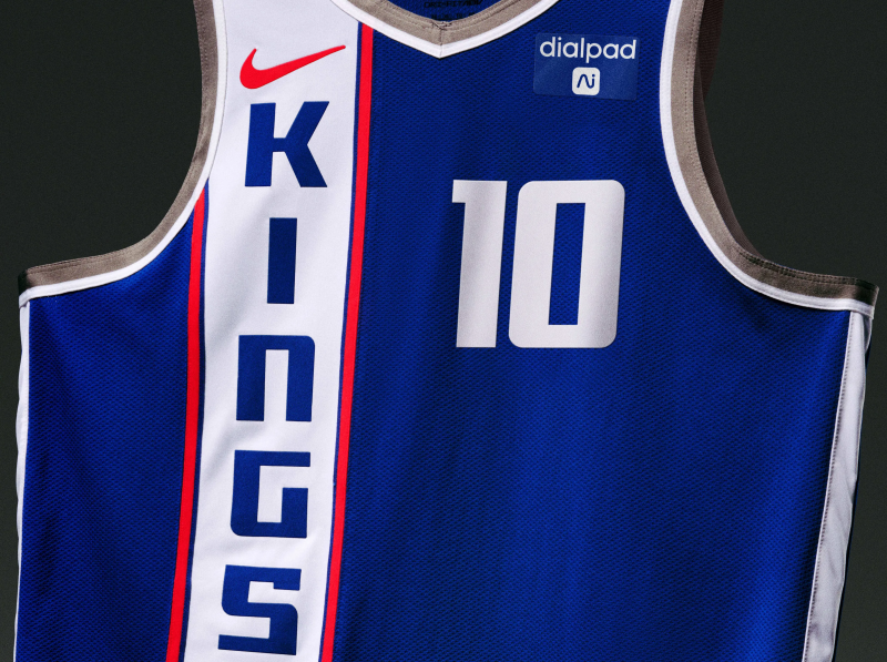
6. Sacramento Kings
This is how to make a retro jersey modern. The Sacramento Kings' City Edition uniform celebrates 100 years of basketball — yes, they're technically the oldest NBA franchise as they were originally established in 1923. They joined the NBL (a precursor to the NBA) in 1945 as the Rochester Royals and this uniform specifically pays tribute to their time as the Cincinnati Royals. The Kings have had other tributes to their history, but this one feels fresh without trying too hard.
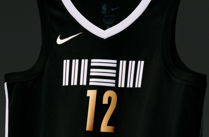
7. Memphis Grizzlies
The Memphis Grizzlies have one of the coolest wordmarks with the "MEM." It's different without being so wacky you don't know what it is. The pop of gold on the black base is one of the better black designs. The one stripe on the side represents the Mississippi River and is a nice anchor to their regular uniforms.
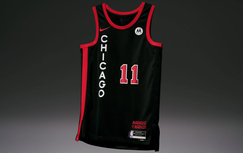
8. Chicago Bulls
This one has a classic feel for a classic team. When fans think of black and red, the Chicago Bulls are probably one of the first teams in all of sports that comes to mind. The vertical design is a nod to the steep nature of Chicago Stadium, also known as "the Madhouse on Madison," which was their home during their first three-peat run.
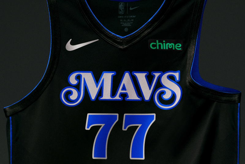
9. Dallas Mavericks
The swirl lettering on the Dallas Mavericks’ City Edition uniform is quite eye-catching. The overall design is inspired by award-winning musician Leon Bridges and his love for the city’s R&B scene. The dark colorway is a vibe.
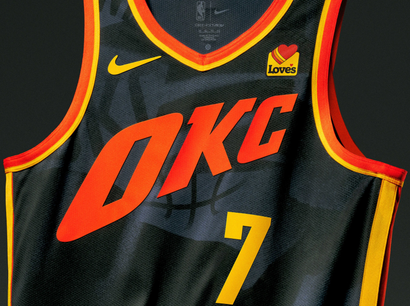
10. Oklahoma City Thunder
The Oklahoma City Thunder don't have the best colors to work with, but they did a nice job of making this jersey pop. The red, orange and yellow are meant to pay homage to the sunset and the city's natural beauty.
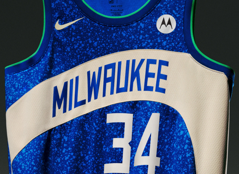
11. Milwaukee Bucks
The blue is a major departure from the Milwaukee Bucks' primary team colors, but it works. The City Edition design is meant to celebrate Lake Michigan with a speckled pattern that emphasizes community. The white swoosh line is meant to emulate the shape of the architecture of Fiserv Forum, which is a nice touch.
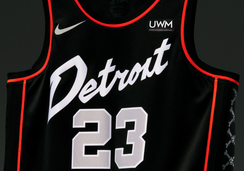
12. Detroit Pistons
The Detroit Pistons' City Edition uniform is edgy and cool. It's a tribute to the Detroit Bad Boys and Chuck Daly, who led the team to back-to-back NBA championships, and does a good job embracing the glory days.
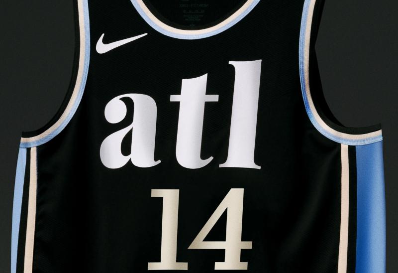
13. Atlanta Hawks
There isn't much of a story behind the Atlanta Hawks' City Edition uniform, but the lowercase letters, meant to invoke Southern charm, are cute and different.
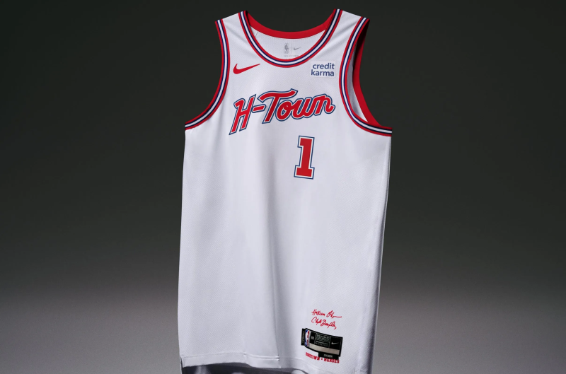
14. Houston Rockets
Th Houston Rockets jersey is clean and straightforward. The "H-Town" wordmark feels true to the city without trying too hard. It's an homage to Hakeem Olajuwon and Clyde Drexler and feels like a classic.
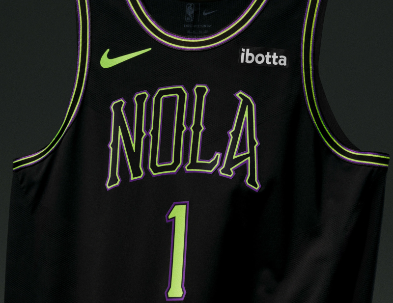
15. New Orleans Pelicans
The pop of lime green on the Pelicans' City Edition uniform feels very New Orleans. The letter design and color scheme does a good job emulating a fun night on the town and invoking a sense of mystery.
16. San Antonio Spurs
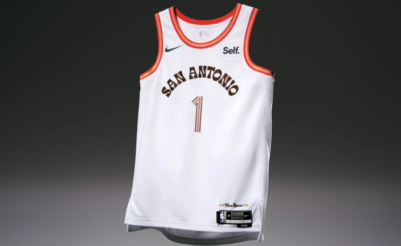
Without explanation, fans might not realize this is a San Antonio Spurs jersey. That's not a bad thing. The nod to the 1968 World's Fair feels authentic to the city's culture and the "Viva Spurs" above the tag with a splash of color is inviting.
17. Golden State Warriors
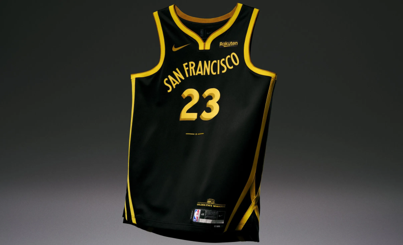
The Golden State Warriors wanted to emulate trolley tracks with this linear design. It is eye-catching (and better than last year's weird stomach rose). The "San Francisco" wordmark does a nice job of mimicking the hills of the city.
18. Philadelphia 76ers
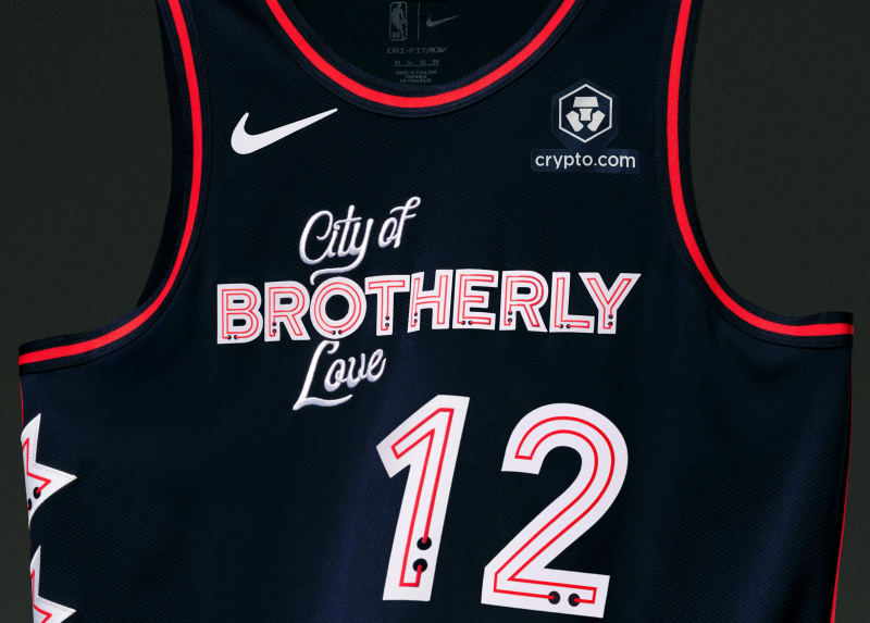
The Philadelphia 76ers' City Edition uniform feels kind of expected by using "City of Brotherly Love" again. The stars and neon sign details feel too much "Viva Las Vegas."
19. Toronto Raptors
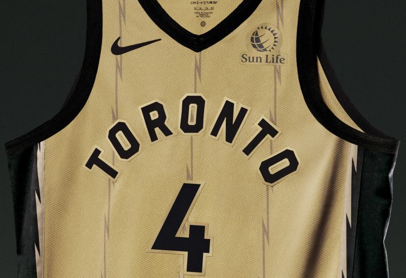
Last year's City Edition uniforms for the Toronto Raptors were really thoughtful and detailed. This one's not ugly or anything, but it feels like they just wanted to make it edgy by using zig-zags instead of stripes without much intention or storytelling.
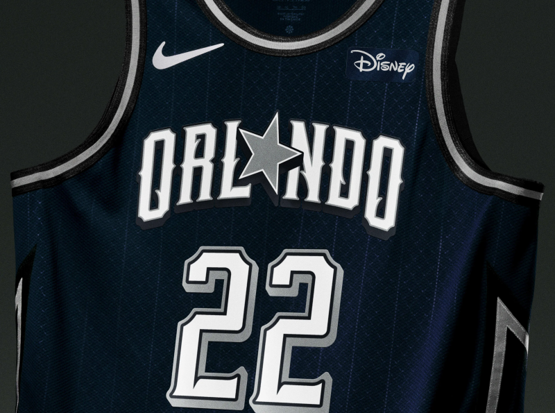
20. Orlando Magic
The star in place of the "A" is supposed to be a throwback element and celebrate the Orlando Magic's 35th anniversary. But overall the design looks too much like a Dallas Cowboys basketball jersey.
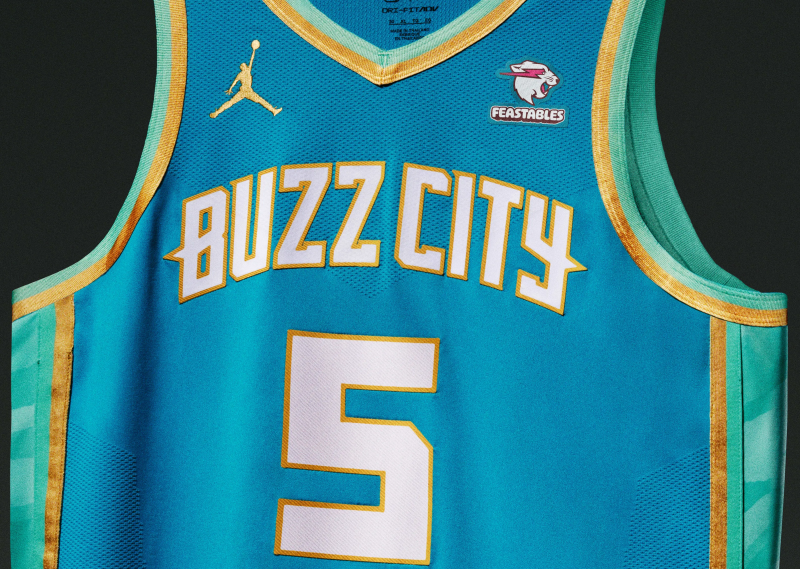
21. Charlotte Hornets
The Charlotte Hornets' City Edition uniform again pays homage to the U.S. Mint. But the teal and mint green colors clash too much. Last year's uniform with the black base is much better.
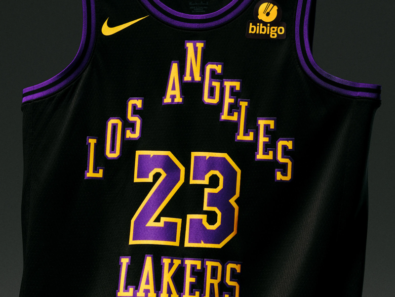
22. Los Angeles Lakers
The Los Angeles Lakers' City Edition uniform is boring and the lettering is awkward. Last year's jersey had less design elements, but looked cleaner and stood out because of the pop of purple.
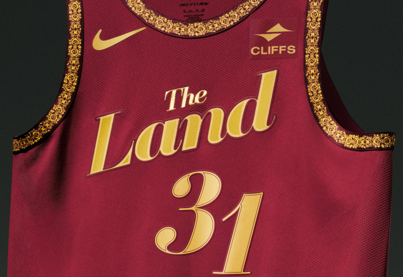
23. Cleveland Cavaliers
The return of "The Land" wordmark on the Cleveland Cavaliers' jersey is a good call. But the use of the team colors isn't anything fresh and the ornate gold trim feels frilly.
24. Miami Heat
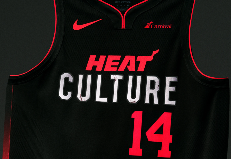
The Miami Heat hurt themselves in the long run by having such amazing Vice City uniforms and shelving them. Then coming up with mediocrity like this. Nothing will ever be the same.
25. Boston Celtics
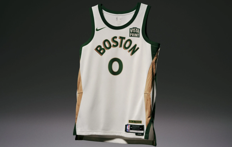
The Boston Celtics' City Edition uniform has wood stripes on the sides, meant to pay tribute to the peach baskets that Dr. James Naismith used in Springfield, Mass., to develop the game of basketball, and also the area's history of furniture makers. It screams gimmicky for a team with so much tradition and history of its own.
26. Brooklyn Nets
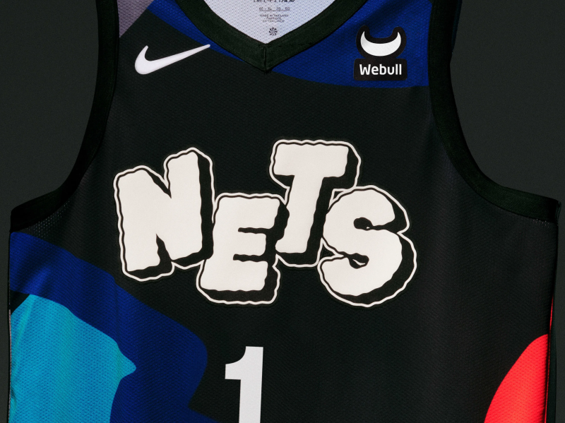
For their City Edition uniform, the Brooklyn Nets worked with pop culture phenom KAWS, who hails from the city. But fans would have no idea based on this design, which is basically a hodgepodge of color. There's not one of his signature X's in sight.
27. Los Angeles Clippers
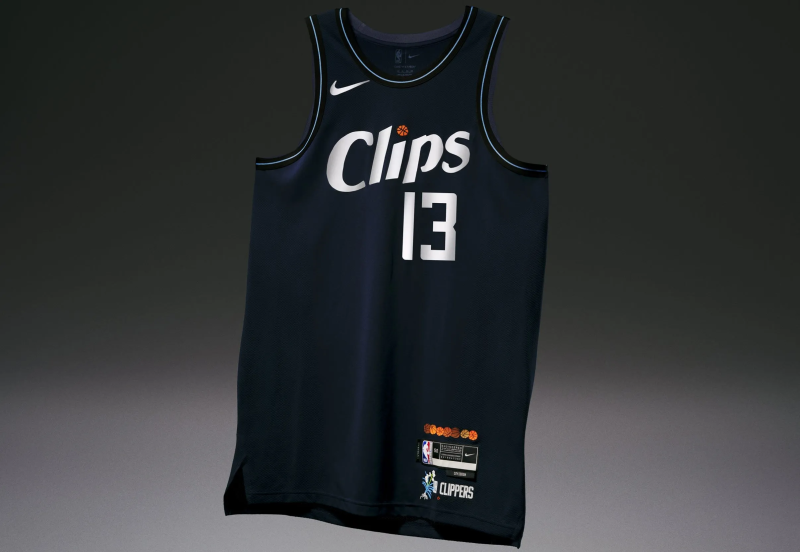
The Los Angeles Clippers also worked with a local artist. They brought in Jonas Wood, who's known for his colorful still life paintings. These jerseys could have been much more whimsical. Instead, they feel like the team just took random elements of their own (a basketball to dot the "I") and Wood's work (a flower in the corner) without much thought for cohesion.
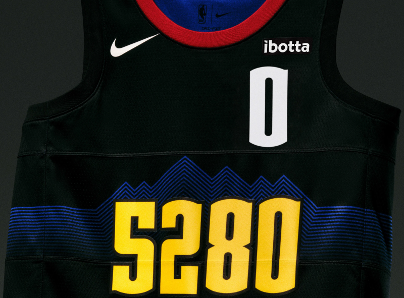
28. Denver Nuggets
Do opposing fans get annoyed at how often Denver teams tout that they play in the "Mile High City?" The defending-champion Nuggets rub in that fact again here, but the number wordmark (as in 5,280 feet equal a mile) right under the player number is not the move.
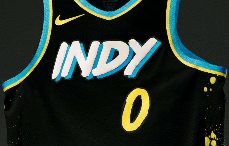
29. Indiana Pacers
Fans will need to wear sunglasses inside Gainbridge Fieldhouse with these highlighter uniforms. The Indiana Pacers jerseys are meant to celebrate the local street art, but come across as childish.
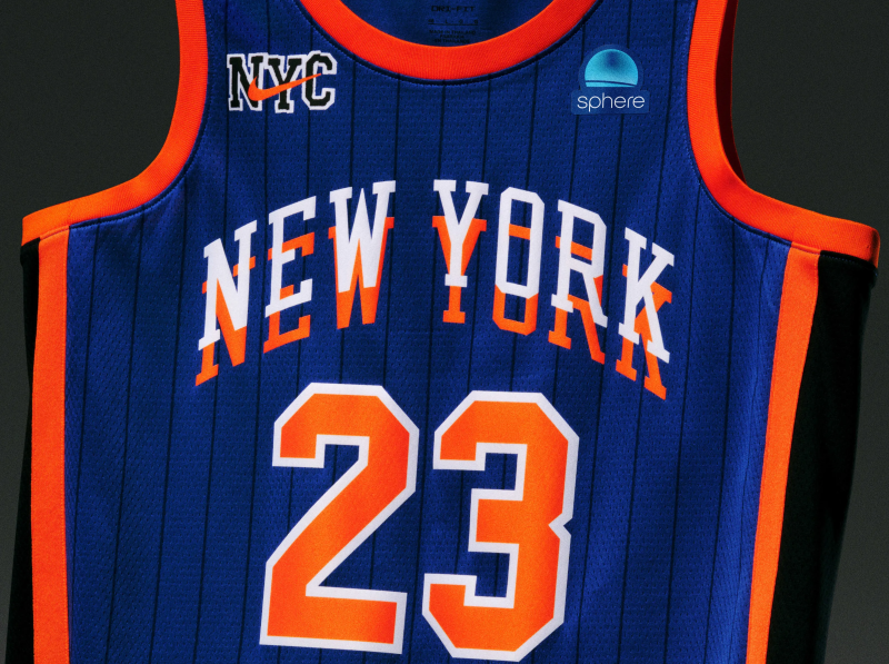
30. New York Knicks
The New York Knicks have so much tradition and history to build off – and they worked with KITH again – this jersey should be a work of art, not an eyesore. The wordmark feels like an optical illusion. And why do they need "NYC" with the Nike logo in the corner, too?
Disclaimer: The copyright of this article belongs to the original author. Reposting this article is solely for the purpose of information dissemination and does not constitute any investment advice. If there is any infringement, please contact us immediately. We will make corrections or deletions as necessary. Thank you.


